I’ve never considered myself a modeler or theoretical physicist. Even now, as I find myself modifying model source code, I still view it as territory outside my comfort zone. My true strength has always been in data - handling it, analyzing it, and bringing it to life through visualization.
Recently, my work has shifted from analyzing observational data to examining simulation outputs, putting these analytical skills to a new kind of test. This transition has led me to explore various tools for characterizing wave-like behavior in discrete data, whether it comes from observations or simulations. In this post, I want to share some key insights I’ve gained about one of these analytical tools and their applications.
Waves
We all know waves. They are curvy, periodic, and they move. The simplest scenario of wave is that which travels along one dimension over time. It’s described by the following second-order linear partial differential equation,
where is the wave speed.
A wave can take any forms, take for example the 1D standing waves below. The total wave (standing wave) is made up of two wave modes, a negative and positive traveling wave modes. The wave evolves over time, at each position of the x-axis the amplitude changes over time.

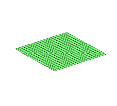
Then we can have a 2D wave function, where the amplitude at x- and y- coordinates in a system change and evolve over time as shown below,
It may be the case that you have observations or simulation outputs in any shape or number of dimensions that has an underlying wave-like behaviour. In this case you may want to use certain tools to analyze your data, and extract the characteristics within the data.
A wave
Let’s create a simple wave dataset. We’ll generate a sinusoid that moves through space and time (1D) with a decreasing amplitude in the spatial direction:
where , and . Here, represents the decay length scale.
For a general sinusoidal function , the angular frequency is the coefficient of . In Equation 1, we have . Comparing this to the standard form, we see radians per unit time.
To find the wavelength , we look at how changes. Since , one wavelength corresponds to a phase change of . Thus, and . Therefore, .
Here’s what the wave described by Equation 1 looks like at different spatial distances ():
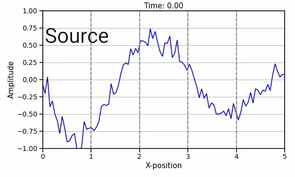 Figure: Visualization of the wave defined by Equation 1 over time and the x-positions with added noise.
Of course I added noise to make the example more realistic as scientists usually deal with background signals like noise. The vertical dashed lines in the plot will serve a purpose below. The question now is how do we characterize this wave? In the real world we don’t know the underlying equation, so I am interested in extracting the period and spatial wavelength straight from the signal.
Phase computation
To characterize wave-like features in our data, let’s pick six evenly spaced spatial locations, let’s say , the same vertical dashed lines on the figure above. Next we take the time evolution of the amplitude at those locations, and we will compute the analytic signal of each time series, using the Hilbert transform.
Here is a short AI generated discussion on the Hilbert transform for more information. Source: The Hilbert transform by Mathias Johansson
The analytic signal is a complex-valued representation of a real-valued signal. It’s formed by taking the original signal and adding its Hilbert transform as its imaginary component.
We can visualize it as a point moving in the complex plane:
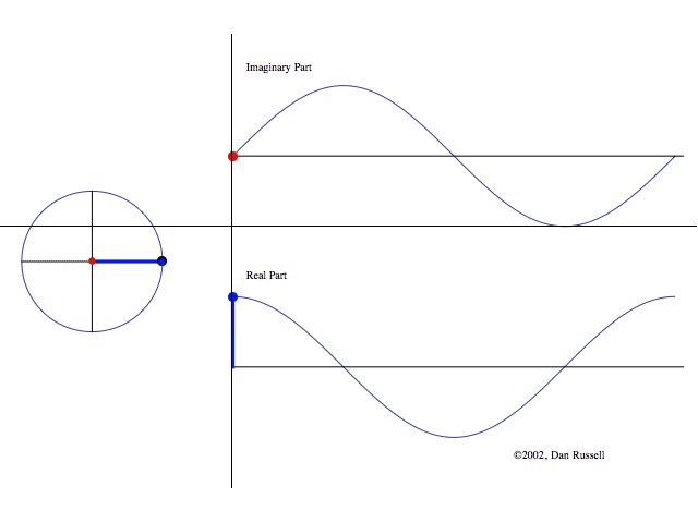 Figure: Visualization of the analytic signal in the complex plane. Top shows the imaginary component, and the bottom shows the real component. Left hand side shows the complex plane.
At each moment in time, the analytic signal’s value corresponds to a point in this plane (left hand side of figure).
- The magnitude of the analytic signal is the length of the line connecting the origin to that point. This represents the instantaneous amplitude of the signal.
- The phase is the angle this line makes with the positive real axis.
The Hilbert transform, by providing the imaginary component of the analytic signal, enables us to calculate this phase. This is done by calculating the angle of the point on the plane,
Now we can visualize the unwrapped phase over time, that is the progression of the wave propagation over time:
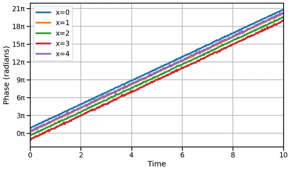 Figure: Visualization of the wave unwrapped phase over time
Here we see the wave progresses linearly over time, that is straight lines, indicating no acceleration or change in propagation rate. The Hilbert transform and the analytic signal reveal how the signal’s frequency changes over time, making them essential tools for analyzing complex, evolving signals.
The time for the phase to change by corresponds to one period. By calculating the slope of the phase vs. time plot, we can determine the frequency and, subsequently, the period of the wave.
We observe different phase offsets for various x-positions, with each color line shifted up or down,indicating spatial propagation of the wave. This phase offset varies at each spatial location. To better visualize this, we can examine the unwrapped phase over spatial distance at fixed timesteps:
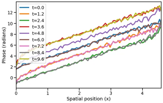
This plot shows the wave’s progression along the x-direction. The slope of the line relates to the wavelength . A steeper slope indicates a shorter wavelength. The phase offset here is due to time evolution, not spatial evolution.
Both and are functions of and respectively, but since we are drawing the wave snapshots at fixed and , we can see how the phase evolves at constant phases offsets, and give us information about the underlying angular frequency , and wavelength of the wave. In fact, we know
By fitting a line and extracting the slopes we can come up with estimates to and . In this experiment we get, , and . These numbers should be familiar since they are and respectively (with a margin of error).
These are exactly the properties embedded in the signal by Equation 1! Therefore, we successfuly characterized the underlying wave in the data by obtaining,
- Angular frequency: rad/unit time, or, a period of 1 unit time,
- Wavelength: x-axis units.
In practice, these values can be the frequency of a sound wave, or the wavelength of a perturbation traveling through the atmosphere.
Conclusion
In this post, we explored the characterization of wave-like data using a combination of mathematical tools and visualization techniques. By generating a simple wave dataset and applying the Hilbert transform, we were able to extract key wave properties such as the angular frequency and wavelength. This approach demonstrates the power of combining theoretical knowledge with practical data analysis skills to uncover underlying patterns in complex datasets. Whether dealing with observational data or simulation outputs, these methods provide a robust framework for analyzing wave phenomena in various scientific fields.