What One Winter Can and Can’t Tell You When Verifying an Atmospheric River Detector Across 13 Seasons
The same neural network looked useless on one storm season and skillful on two held-out winters. The network didn’t change. The test did.
Between late December 2022 and mid-January 2023, atmospheric rivers came ashore in California one after another. I had a small neural network trained to find these storms on weather maps, and that stretch of weather happened to become its test. Scored on twelve days in January, the network ranked maps only a little better than a coin flip, and a statistical model built on three numbers per map beat it comfortably. Scored later on two whole winters it had never seen, the same kind of network beat every reference I put next to it, by a wide margin.
That turnaround carries a lesson well beyond atmospheric rivers: a score belongs to the model and to the sample it was scored on. When the test period is a different weather regime from the training period, and when hundreds of test samples turn out to be a few dozen moments in time, the score describes the weather as much as the model. To see how that happened here, start with what the detector actually looks at.
What the Detector Looks At
An atmospheric river (AR) is a long, narrow corridor of water vapor moving through the lower atmosphere, usually carried along ahead of the cold front of a midlatitude storm. Figure 1 shows one at 12 UTC on 10 March 2023: a band about 5,600 km long running from west of Hawaii to the California coast. When a river like that meets the coastal mountains, the air is forced upward, cools, and gives up its water as rain and snow. On the US West Coast, ARs bring much of the winter’s precipitation and many of its floods (Dettinger et al., 2011), which is why forecasters track them so closely.
The quantity that defines an AR is integrated vapor transport (IVT). Take a column of air from the ground up to about 300 hPa, roughly 9 km, and ask how much water vapor flows sideways through it each second, per metre of width. Because it multiplies humidity by wind, IVT measures a flux rather than an inventory: humid but stagnant air has low IVT, and moderately moist air moving fast can have high IVT. Its units are kg m⁻¹ s⁻¹. The usual working threshold for AR conditions is 250, and the core of the 10 March river reaches 954.
The maps come from ERA5, the reanalysis produced by the European Centre for Medium-Range Weather Forecasts: a reconstruction of past weather that blends observations into a weather model to give a complete map every hour on a 0.25° grid. I use it every six hours over the North Pacific, 10–60°N and 180–110°W, and treat it as the truth.
The labels come from a rule applied to the whole map. Every connected region with IVT ≥ 250 is measured, and it counts as an AR only if it is at least 2,000 km long, at least twice as long as it is wide, and centred at 20°N or farther north. The detector never sees the whole map. It sees a patch: a 32° square of the IVT field, coarsened to 0.5° so that it becomes a grid of 64 by 64 numbers. Six overlapping squares cover the domain at each time, and a square is labeled AR if at least a quarter of its area lies inside a labeled river. Because the label depends on the geometry of the entire river, it can’t be read off the square by thresholding its pixels, so a detector has to learn what a piece of a river looks like from the inside.
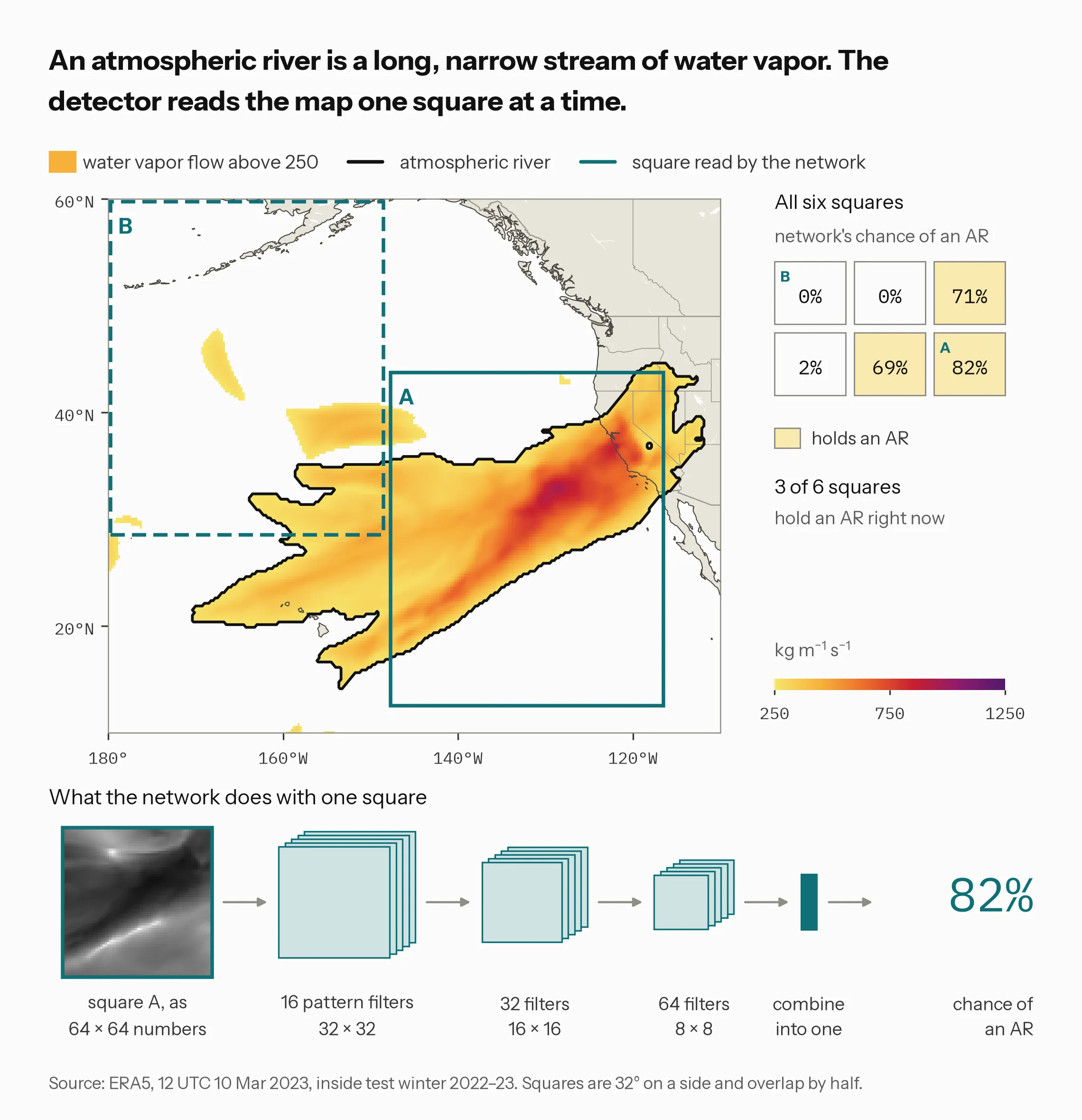
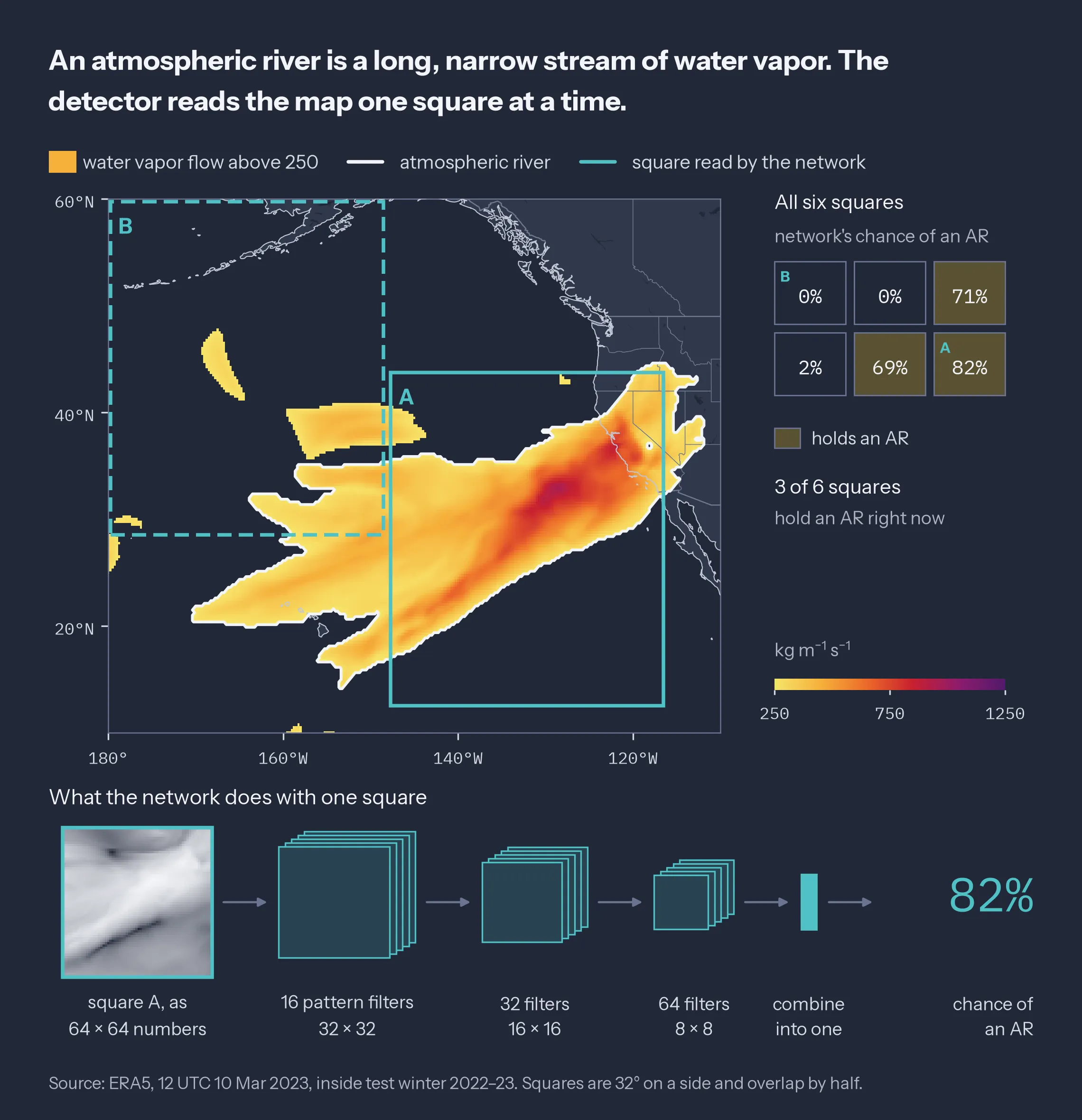
Figure 1: The detection task at 12 UTC on 10 March 2023, in test winter 2022–23. Teal squares A and B are two of the six patches; the grid gives SimpleCNN’s probability for each patch, filled where the patch is labeled AR. Bottom: the network’s three convolution, ReLU, and max-pool blocks and dense head, reading patch A as log(1 + IVT).
The detector is a convolutional neural network (CNN), the family of models behind most image recognition. It slides small 3 × 3 filters across the square, each of which learns to respond to some local pattern such as an edge or a ridge of high IVT. Then it halves the image and repeats. Three rounds of this, with 16, 32, and then 64 filters, shrink the square from 64 × 64 to 8 × 8 and build up from local texture to larger shapes, and a final layer combines everything into one number between 0 and 1. For square A that number is 0.82; for square B, empty ocean north of the river, it is 0.00. The whole network has about 286,000 adjustable weights. There’s a good reason to expect it to work: an AR is a shape, a long filament of high transport, and a filter that responds to that shape responds to it wherever in the square it happens to sit.
Half of the squares in Figure 1 hold an AR at that moment. Average that fraction over every time in a set of maps and you get the base rate, the fraction of patches labeled AR. It sounds like bookkeeping. It turns out to be the most important number in the rest of this story.
How You Score a Detector
You train the model on one stretch of time, tune it on a later one, and test it on a third that it never touched. The middle set is the validation set (labeled “tuning” in the figures): it decides when to stop training and where to set decision thresholds. The order matters because weather is persistent. A storm on Tuesday is usually still there on Wednesday, so if training and test maps were shuffled together, the test would mostly be the training data shifted by a day. Splitting in time order, with gaps between the sets, keeps that leak shut.
A score means little on its own, so the network faces three simpler references on the same patches. The climate average (climatology) ignores the map and always forecasts the AR frequency seen in training. The moisture-area rule (pixel-fraction rule) forecasts from the share of the square with IVT above 250. Logistic regression works from three summaries of the square: its maximum IVT, its mean IVT, and how elongated its largest high-IVT region is. If the network can’t beat these, its extra complexity isn’t buying anything.
Two scores carry most of the argument. AUC, the area under the ROC curve, measures ranking only: pick one AR patch and one non-AR patch at random, and AUC is the chance the model gives the AR patch the higher number. An AUC of 0.5 is a coin flip and 1 is perfect, and it says nothing about whether the probabilities themselves are right. That’s the job of the Brier score, the mean squared difference between the forecast probability and the outcome (1 for AR, 0 otherwise). The Brier skill score compares it to a reference forecast:
A BSS of zero means no better than the reference, a negative value means worse, and 1 is perfect. Everything hinges on what goes into BS_ref, and that is where my first attempt went wrong.
The Test Was One Storm Season
My first real-data run covered 51 days, from 1 December 2022 to 20 January 2023, and cut the maps more aggressively than Figure 1 does: 32° squares overlapping by 75%, fifteen per time step, each labeled AR when 10% of it sat inside a river. I trained on December, validated on 3–6 January, and tested on 9–20 January. The CNN reached an AUC of 0.589; the logistic regression reached 0.771. Every model had a negative Brier skill score: −0.27 for the CNN, −0.54 for the logistic regression, −1.11 for the climate average. The tempting reading is that the network is bad and the simple model is good. The more useful question is whether the test was measuring the network at all. It wasn’t, and working out why changed how I verify everything in this project.
Start with the base rate: 0.485 in training, 0.804 in validation, and 0.856 in test. Validation and test fell entirely inside the run of back-to-back ARs that hit California from late December 2022 into mid-January 2023, while training was mostly the calmer weeks before it. Figure 2 shows this day by day: every patch in the test window held an AR on six of its twelve days. The test set wasn’t just later than the training set. It was a different weather regime.
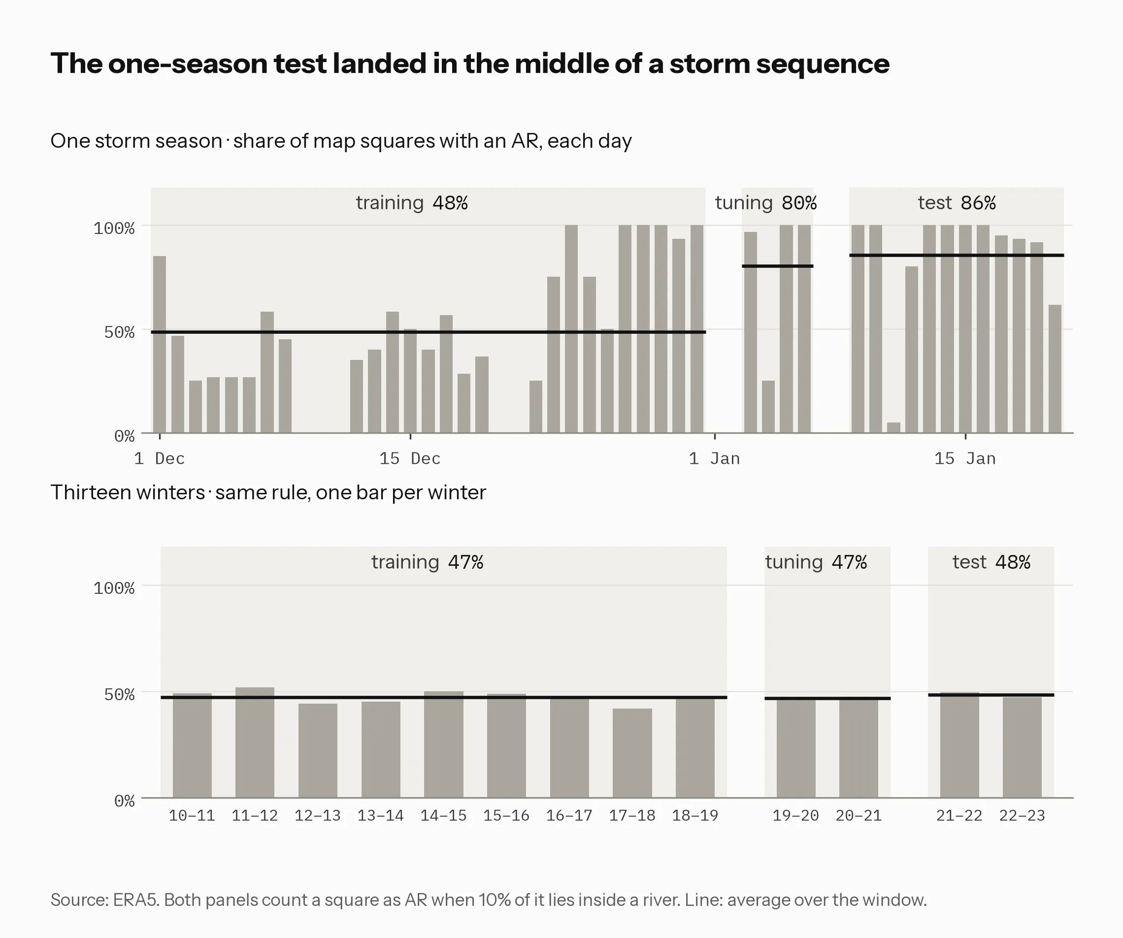
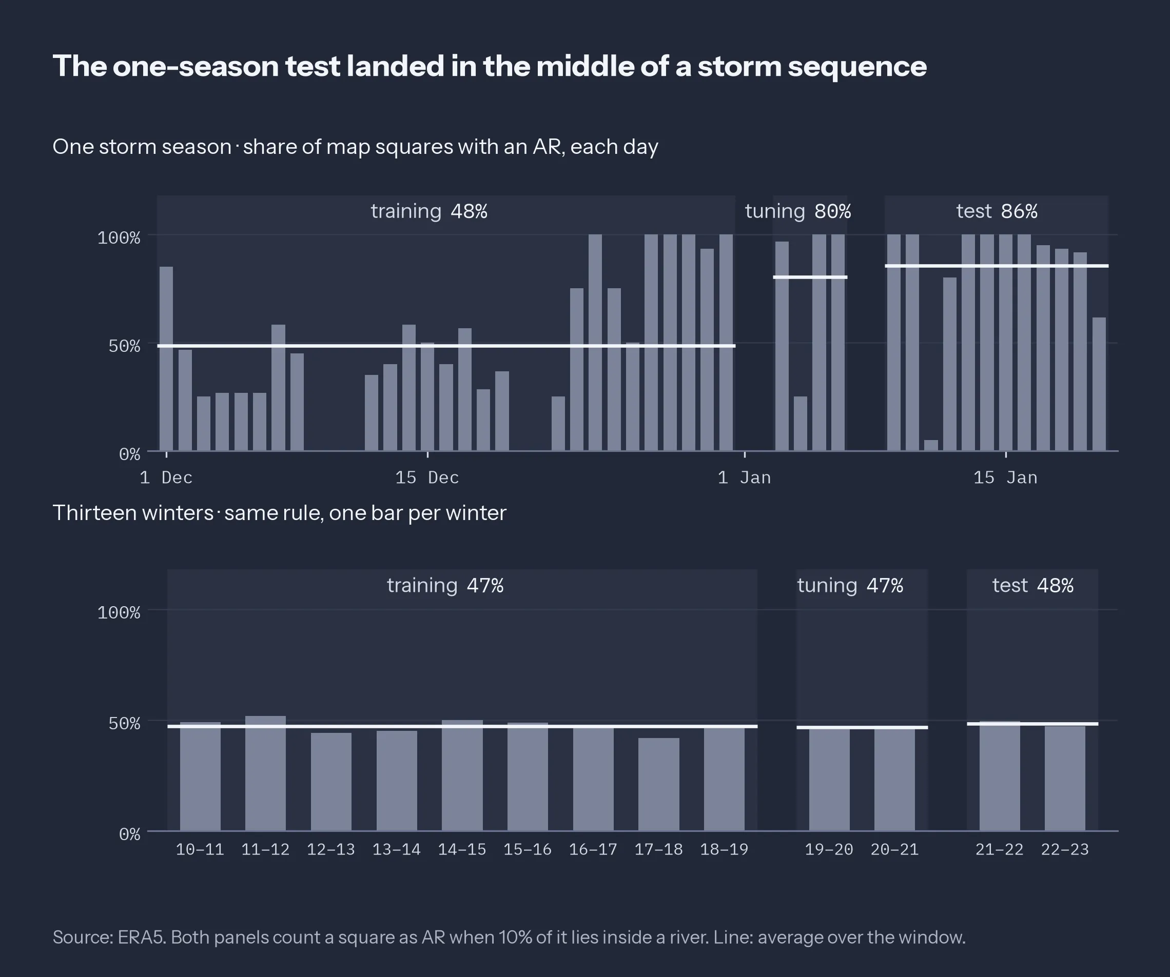
Figure 2: Base rate under the 51-day run’s 10% coverage rule. Top: each day of the 51-day run, with the training, validation (“tuning”), and test windows shaded. Bottom: each of the 13 winters of the multi-season design. Lines: split base rates.
That shift alone is enough to wreck the probabilistic scores. A climatology forecast fit on training says 0.485 for every patch, and the test sample’s own frequency is 0.856. Any model trained on December inherits December’s sense of how often ARs happen, so its probabilities are too low for January no matter how well it ranks patches. The Brier skill score in that run compared each model against the test sample’s own climatology, a reference that already knows the answer is “mostly AR,” and every model lost to it.
The patch design made it worse. With fifteen heavily overlapping squares and a 10% coverage rule, one large AR turns most of the map positive, a problem I’ll call saturation: the test set held 104 negatives among 720 patches. Those 720 patches also came from only 48 six-hourly maps, and overlapping patches from the same time are not independent, so the effective sample size was closer to 48 than to 720. A test set of 104 negatives drawn from twelve days is a test of twelve days.
None of this is exotic. If you evaluate an AR tool on a single real-time season, you are in exactly this position: the reference climatology and the number of distinct events control the score as much as the tool does. The bottom panel of Figure 2 shows what changes when the splits are whole winters instead. Under the same 10% rule, the three splits of the 13-winter design sit at 0.471, 0.467, and 0.484, and no single winter strays far from the rest. Whole winters fixed the shift. Saturation needed a different fix, the stricter coverage rule in Figure 1, which is why the base rates from here on sit near 0.2 rather than 0.5.
The Setup: Whole Winters, Two References
The new design uses 13 October–March cool seasons, 2010–11 through 2022–23: 9,432 six-hourly maps. It reads ERA5’s own vertically integrated moisture flux, checked against my own integral (more on that below). I train on nine winters (2010–11 to 2018–19), validate on two (2019–20 and 2020–21), and test on two (2021–22 and 2022–23). The April–September gaps act as six-month buffers, so no storm straddles two splits, and the last test winter contains the entire storm sequence that sank the first run.
The 25% coverage rule came from the sensitivity of the training base rate to that threshold: 0.563 at 5%, 0.471 at 10%, 0.193 at 25%, and 0.037 at 40%. At 10% about half the patches are positive, which is saturation again; at 40% ARs drop below 4% of patches. At 25% a positive patch holds a substantial piece of a river and roughly one patch in five is positive. The resulting base rates are 0.193 in training, 0.188 in validation, and 0.225 in test. 2022–23 is still the most active test winter at 0.237, slightly above the 0.156–0.230 range of the nine training winters but no longer in a different world.
The second change is in the reference. I now report two versions of the Brier skill score:
- BSS_test uses the test sample’s own climatology, ȳ(1 − ȳ). No forecaster knows this number in advance.
- BSS_ref uses the climatology forecast fit on training data, a constant 0.193 here. This is the reference a forecaster actually has.
If the two disagree by a lot, skill is being gained or lost to a base-rate shift rather than to discrimination. In the 13-winter run they differ by less than 0.01 for every model, which is what a clean split should look like. The yes/no scores below use one probability threshold per model, chosen on validation by Youden’s J (the hit rate minus the rate at which non-AR patches get flagged) and never touched on test. The original experiment stays runnable with --config configs/trackb_51day.json, and it reproduces its base rates exactly.
The Ranking Flips
All four models face the same 8,472 test patches and were fit on the nine training winters only. Beyond AUC and BSS, the table adds three yes/no scores. POD, the probability of detection, is the share of real ARs that were called. FAR, the false alarm ratio, is the share of AR calls that turned out wrong; it is a fraction of the calls, not of the non-AR patches. The equitable threat score (ETS) is hits divided by hits plus misses plus false alarms, corrected for the hits a random forecast would get by chance.
| Model | AUC | BSS_test | BSS_ref | POD | FAR | ETS |
|---|---|---|---|---|---|---|
| Climatology | 0.500 | −0.006 | 0.000 | 1.000 | 0.775 | 0.000 |
| Pixel-fraction rule | 0.799 | +0.105 | +0.110 | 0.987 | 0.584 | 0.244 |
| Logistic (max, mean, eccentricity) | 0.826 | +0.215 | +0.219 | 0.829 | 0.560 | 0.248 |
| SimpleCNN | 0.917 | +0.435 | +0.438 | 0.903 | 0.468 | 0.369 |
On the two held-out winters the CNN reaches an AUC of 0.917 and a BSS_ref of +0.438, twice the logistic regression’s +0.219, and its ETS of 0.369 leads the baselines’ 0.248 and 0.244. Its FAR of 0.468 deserves a plain reading: nearly half of its AR calls are false alarms. Youden’s J accepts false alarms readily when the event is the minority class, and a different operating point would trade POD for FAR. Which trade is right depends on who uses the call.
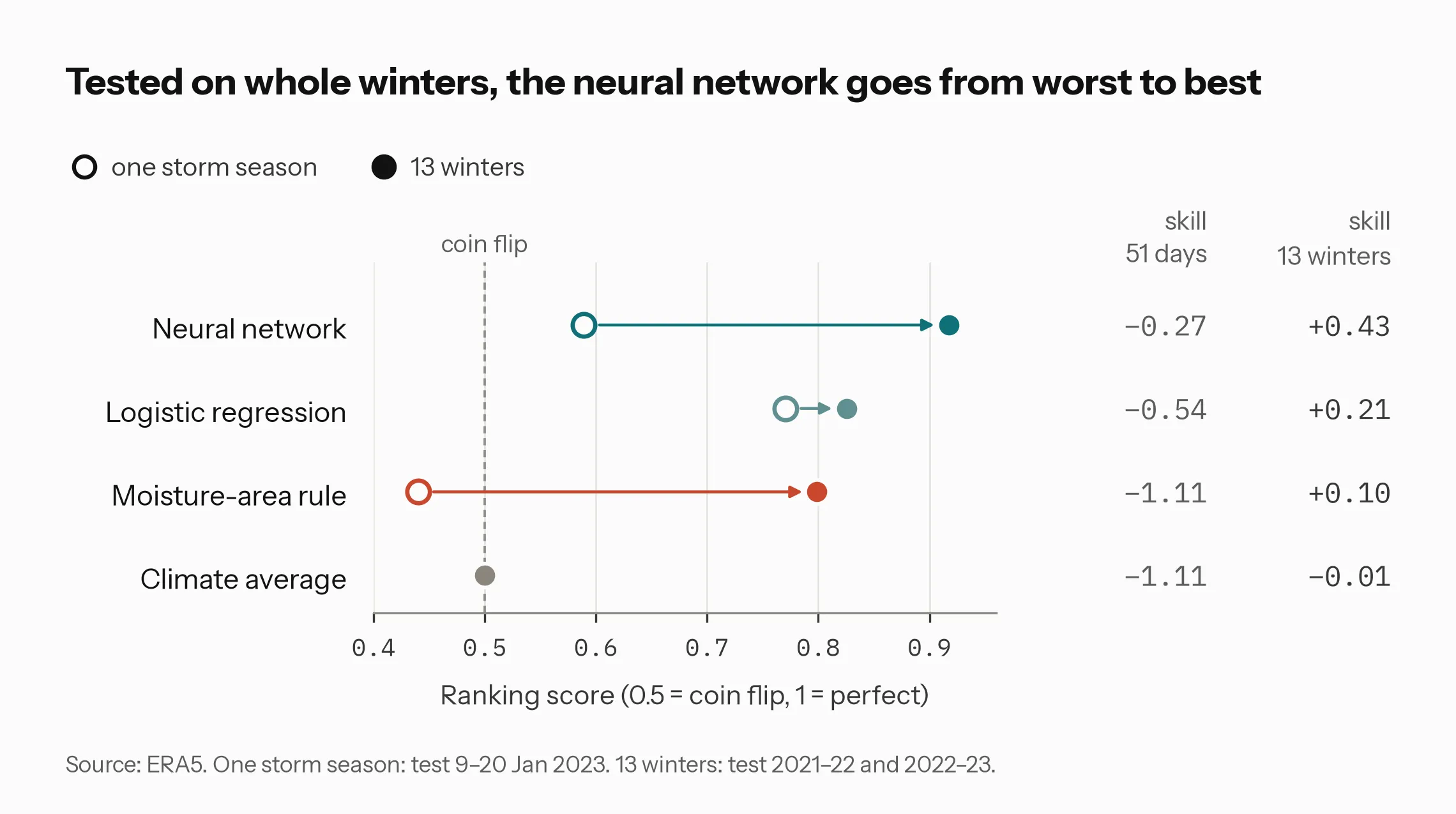
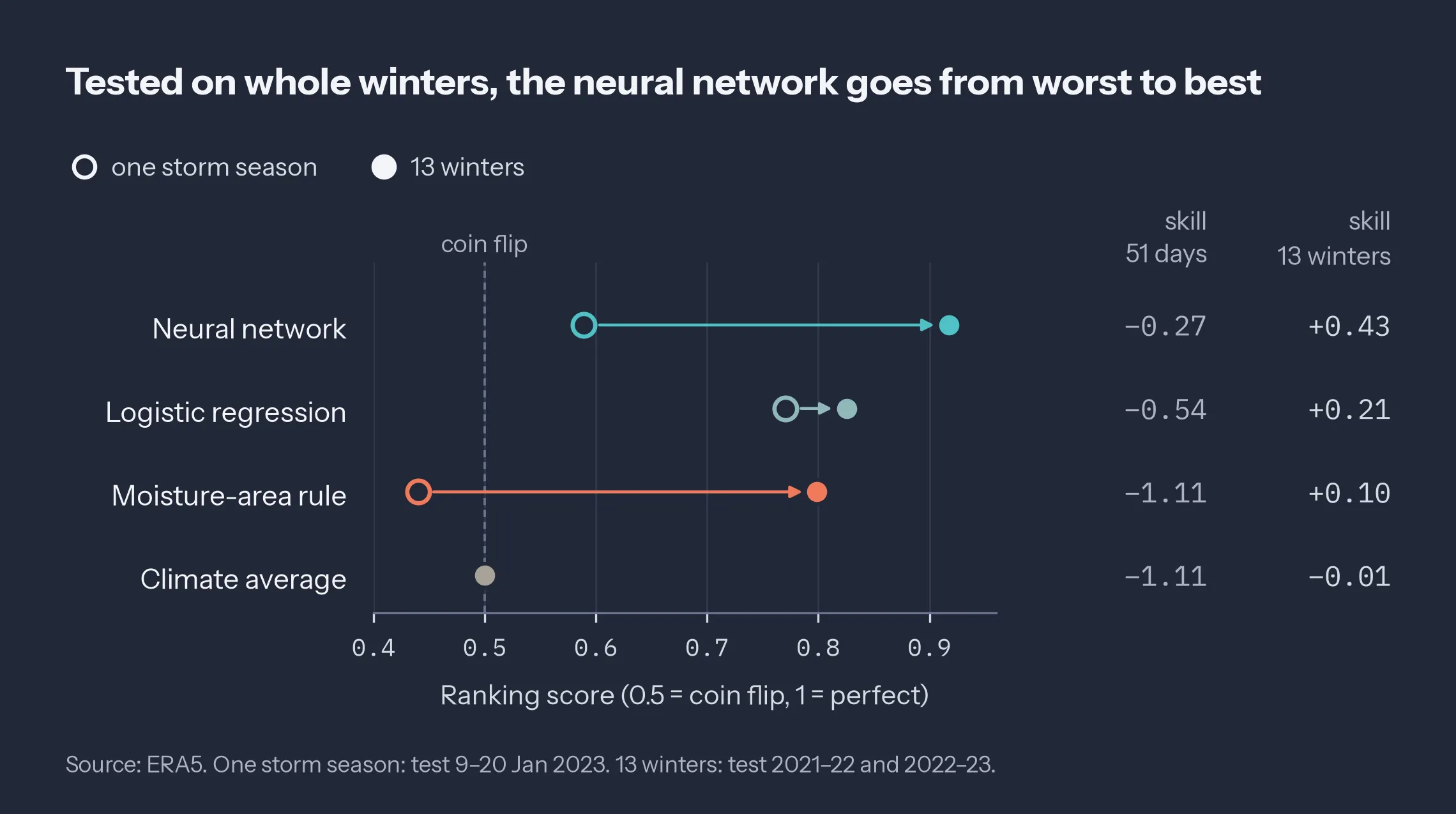
Figure 3: Test AUC in the two designs. Hollow rings: the 51-day run. Filled dots: the 13-winter run. Right: BSS_test, the only reference the 51-day run reported. Plate names: neural network = SimpleCNN, moisture-area rule = pixel-fraction rule, climate average = climatology.
Here’s the part I find most convincing. Broken out by winter, the CNN’s AUC is 0.918 in 2021–22 and 0.917 in 2022–23, while the pixel-fraction rule falls from 0.821 to 0.774 and both baselines lose skill in the stormier winter. The CNN holds steady through the winter that contains every storm from the first run. The storms didn’t get easier. The comparison got fair.
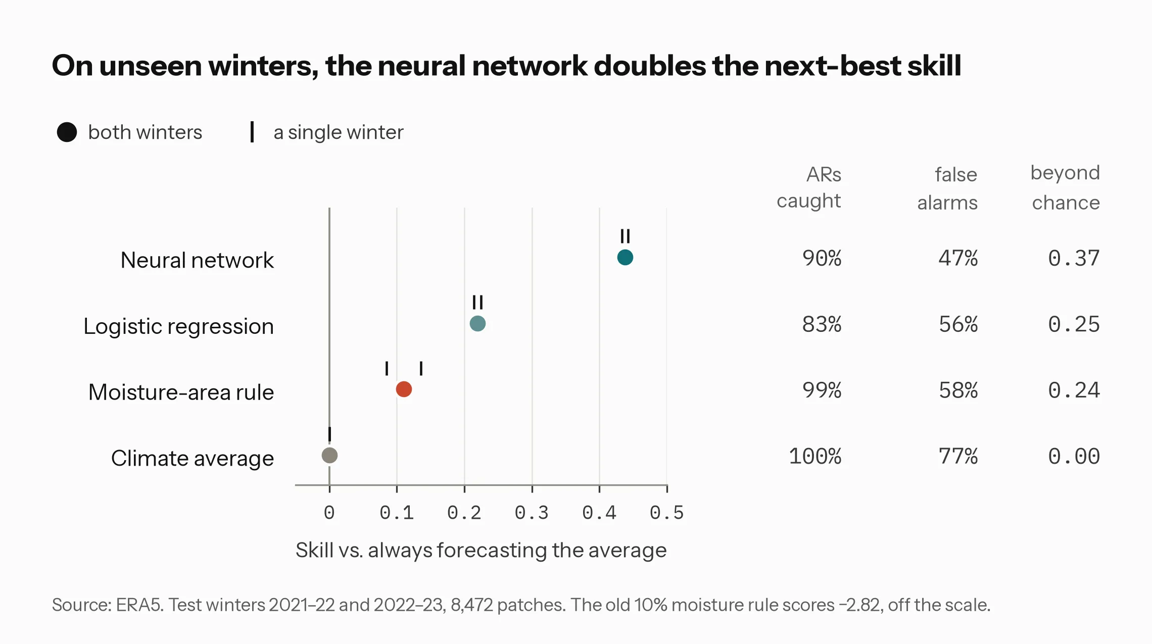
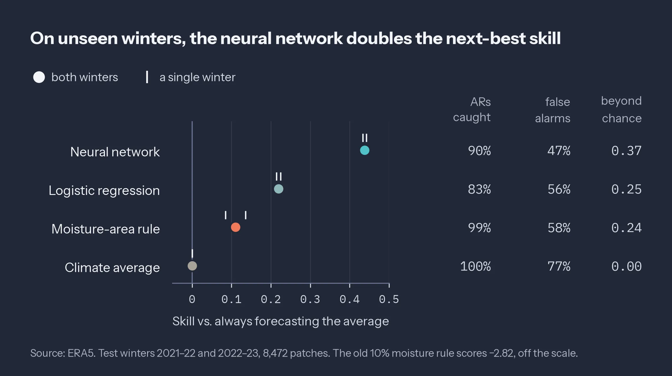
Figure 4: The 13-winter test set. Dots: BSS_ref over both test winters; ticks: each winter alone. Columns: POD, FAR, and ETS at each model’s validation-chosen threshold.
The baselines are what make both outcomes interpretable. The first run’s failure was diagnosable because the table showed the pixel-fraction rule at an AUC of 0.440, worse than chance, which is not something a sensible rule does on a representative sample. The second run’s success means something because three simpler references lost to it on the same patches. The legacy rule is the cautionary entry: the 51-day labeling rule turned directly into a yes/no forecast, flagging a patch whenever 10% of its pixels exceed 250. It calls 7,591 of 8,472 test patches ARs, three quarters of those calls are false alarms, its ETS is 0.034, and its BSS_ref is −2.82.
Two Checks Underneath the Labels
A detector is only as good as the field it reads and the labels it learns from, so both got their own check. The field is IVT, written out in full:
where q is specific humidity and V the horizontal wind, here on 13 pressure levels from 1000 to 300 hPa. The catch is that ERA5 provides pressure-level values even where those levels are below the ground, extrapolated over high terrain. A plain trapezoid over all 13 levels integrates that subterranean air. My integral starts at the surface pressure instead: layers fully above ground use the trapezoid, the layer containing the surface is cut at it, and where the surface pressure exceeds 1000 hPa the thin slab between the surface and 1000 hPa is added.
Against ERA5’s own vertically integrated flux over 80 maps (1–20 January 2023), the above-ground integral gives r = 0.9995, a bias of +0.16, and an RMSE of 5.2 kg m⁻¹ s⁻¹. The plain trapezoid over all levels has an RMSE of 12.6. The map in Figure 5 shows where that difference comes from, and it surprised me. The ochre areas over the Sierra Nevada, the interior West, and Mexico are the expected terrain effect. The ochre band across the northern Pacific is not terrain at all. North of about 40°N the deep winter lows push surface pressure below 1000 hPa, so integrating from 1000 hPa counts air that isn’t there, over open ocean. South of that, under higher pressure, the plain trapezoid misses the slab below 1000 hPa and comes out low. “Below ground” is a surface pressure problem, not only a mountain problem.
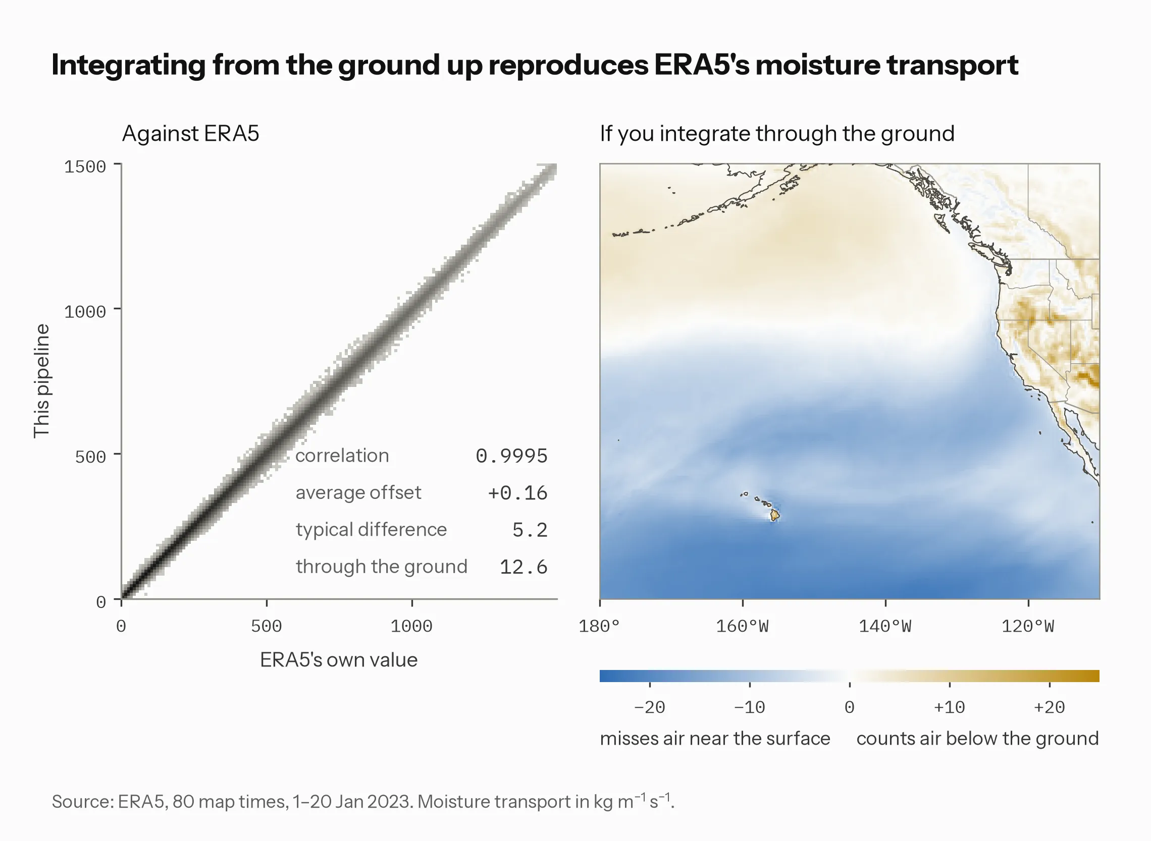
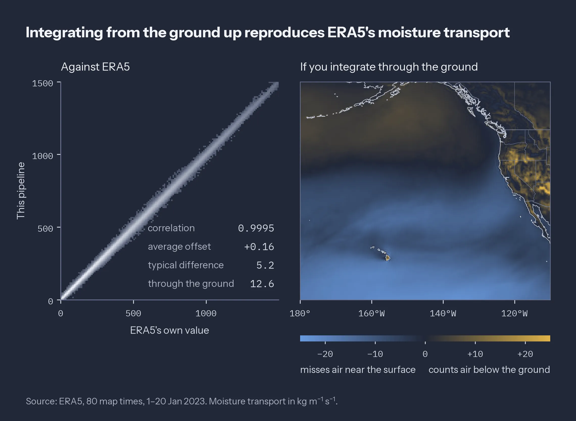
Figure 5: Left: above-ground IVT against ERA5’s vertically integrated moisture flux, 80 maps and 4.5 million grid points. Right: time-mean difference, plain all-levels trapezoid minus above-ground integral, in kg m⁻¹ s⁻¹.
This check covers 80 times from one partial January: enough to justify ERA5’s native integral for all 13 winters, not a climatology of the error.
The labels come from the geometric test described at the start, applied on the full 0.25° map before any patching. Over 13 winters the IVT threshold alone covers 24.6% of the domain and the geometric AR mask covers 8.7%; 8,897 of 66,100 IVT objects pass. Figure 6 shows one time inside the test set. The river aimed at northern California passes, 4,040 km long with a 2.3:1 aspect ratio. The broad plume entering at the western edge is 2,464 km long but only 1.9:1, so it fails. That gap between 25.3% and 11.0% of the domain at a single time is why the old pixel rule flags nine patches in ten.
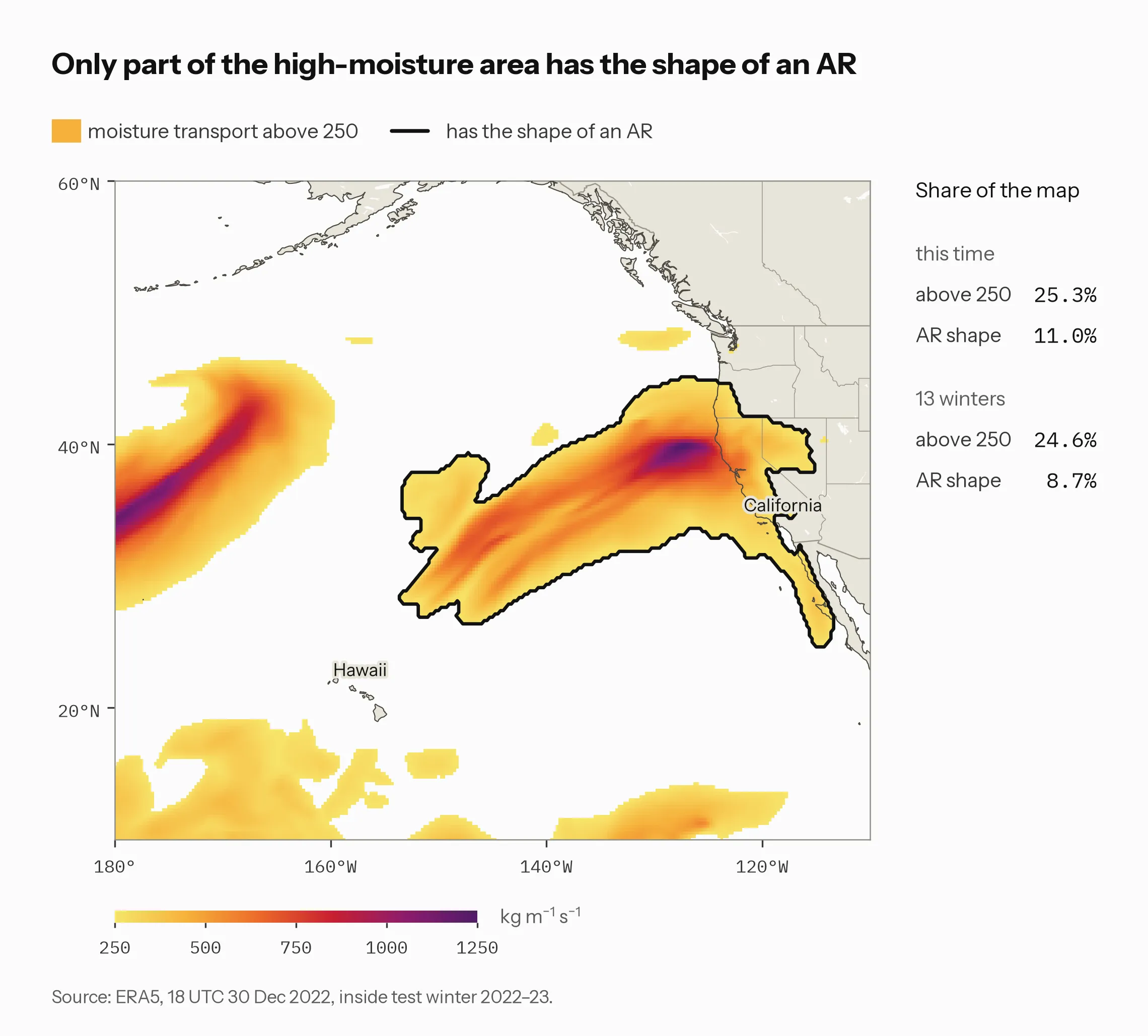
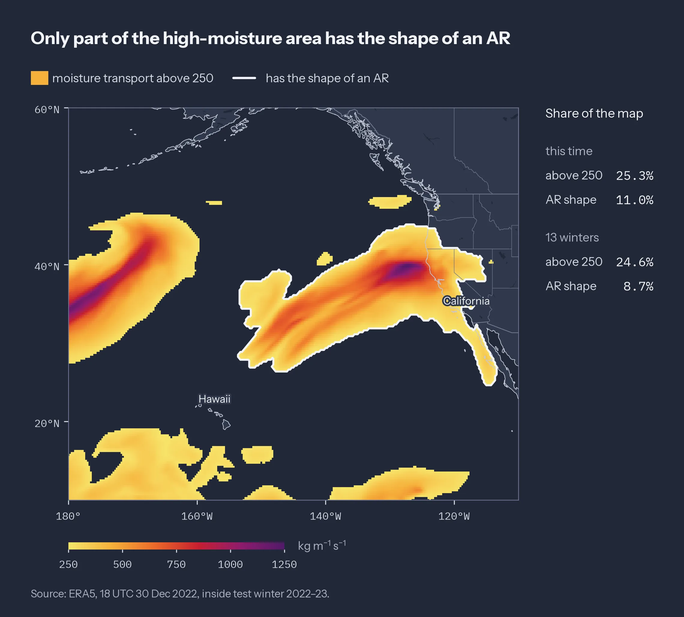
Figure 6: ERA5 IVT at 18 UTC on 30 December 2022, in test winter 2022–23. Shading: IVT ≥ 250 kg m⁻¹ s⁻¹. Outline: regions that pass the geometric AR test.
What It Would Take to Sit Next to AR-AFS
One natural place for a detector like this in operations is as an extra member or a post-processor in an ensemble alongside a dynamical AR forecast system such as the Atmospheric River Analysis and Forecast System (AR-AFS). Nothing here shows it can do that job. What the 13 winters do show is what it would have to clear first.
Calibration comes first. A forecast is calibrated when its 70% calls come true about 70% of the time. The CNN discriminates well, but its probabilities don’t yet mean what they say (Figure 7). When it forecasts about 0.74 the observed AR frequency is 0.88, and at 0.84 it is 0.94: the network is too timid at the top. In the middle it leans the other way, 0.45 forecast against 0.39 observed. It is excellent in the lowest bin, which holds 4,836 of the 8,472 test patches. A calibration map fit on the validation winters, then verified on the test winters, is the minimum before its numbers go anywhere.
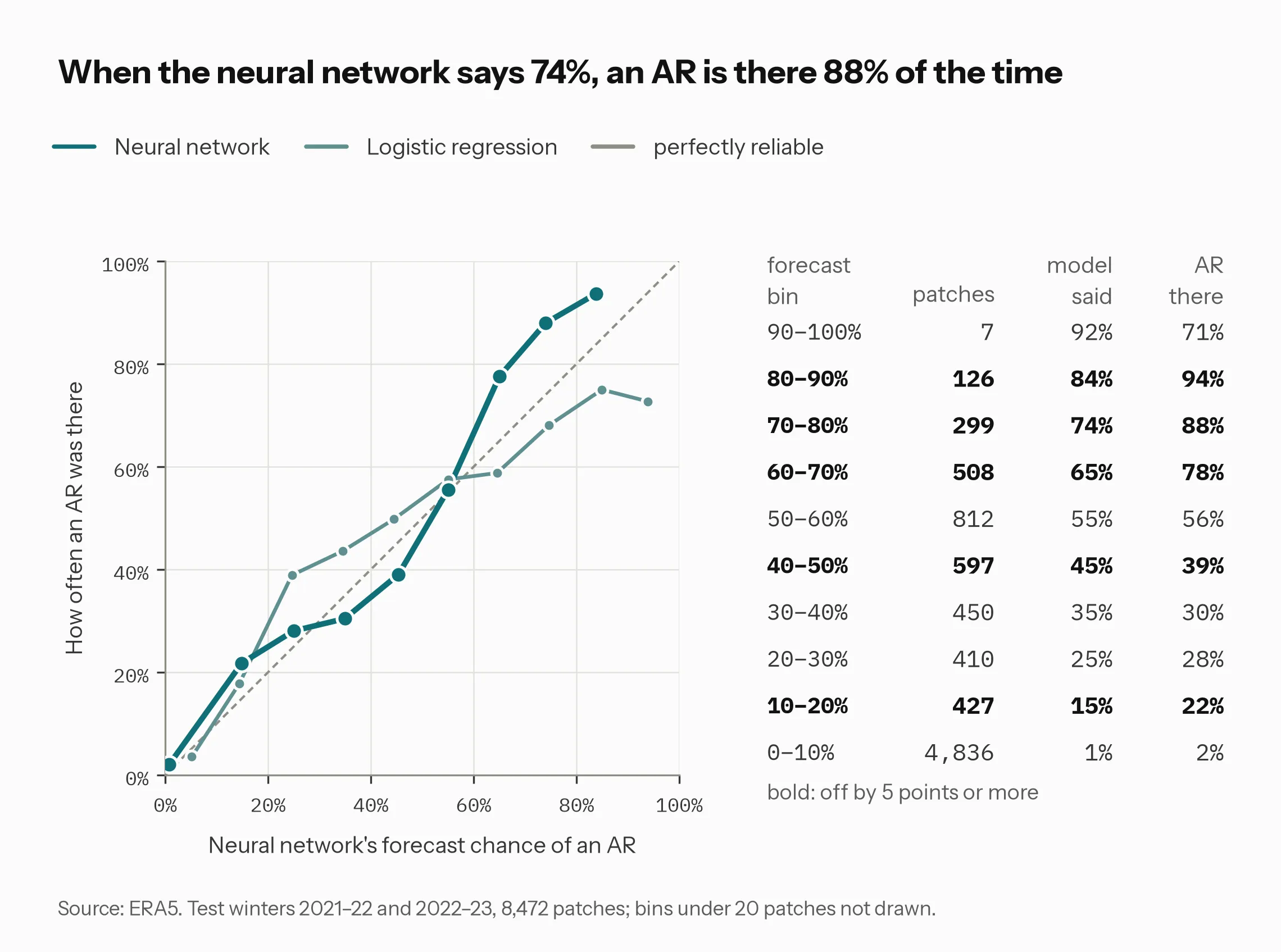
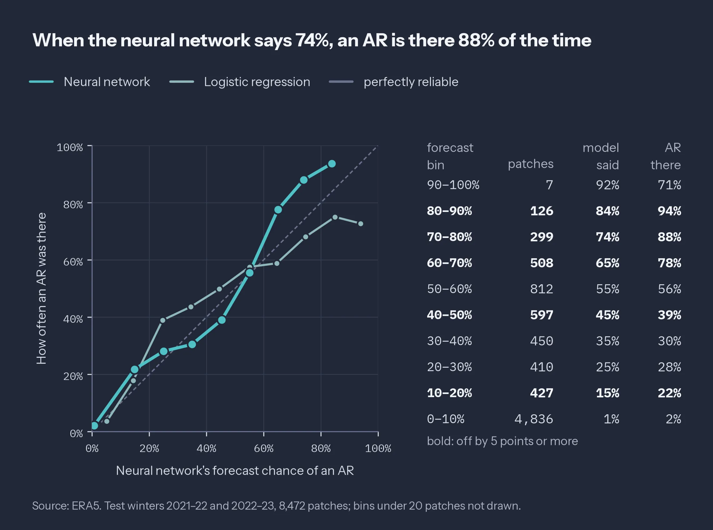
Figure 7: Reliability on the two test winters, ten equal-width bins; bins under 20 patches not drawn. Dashed diagonal: perfect calibration.
Two more requirements follow from everything above. Skill has to hold against the climatology a forecaster would have had, winter by winter; here BSS_test and BSS_ref agree within 0.01 and the two test winters agree with each other, and on 51 days neither would have been true. And the detector has to be retrained for the target system. It learned ERA5 analyses at lead zero, meaning it classifies the map at the time the map describes, while a forecast system has its own grid, domain, lead times, and errors the detector has never seen.
The scope, then, is narrower than the scores might suggest. Everything here is reanalysis, not forecasts; a 12-hour lead option exists in the code but has only been smoke-tested on synthetic data. There is no precipitation, no ensemble, and no comparison against the NCEP Stage IV radar and gauge precipitation analysis, NOAA’s Global Forecast System (GFS), or AR-AFS. The CNN was trained once, with one seed, so I can’t yet put an interval on its scores. And the second test winter is missing 21–31 January 2023, because a partial January file from the first run was reused, which leaves 1,412 test time steps instead of 1,456.
Closing Thoughts
Both runs used the same kind of network on the same kind of data. The first one told me a great deal about one storm sequence and almost nothing about the detector. If you verify an AR tool on a season, report three things next to the score: the base rate in each split, the reference your skill score is measured against, and how many distinct map times stand behind the test set, not how many patches. Those three numbers decide whether the score is about your model or about your winter.
One winter can tell you how a model handled that winter. It takes more than one to tell you about the model.
Reference
Dettinger, M. D., Ralph, F. M., Das, T., Neiman, P. J., & Cayan, D. R. (2011). Atmospheric rivers, floods and the water resources of California. Water, 3(2), 445–478. https://doi.org/10.3390/w3020445
This analysis used ERA5 reanalysis from the Copernicus Climate Change Service over 13 October–March seasons, 2010–11 to 2022–23. The pipeline, configs, and both runs are in atmospheric-river-forecasting.